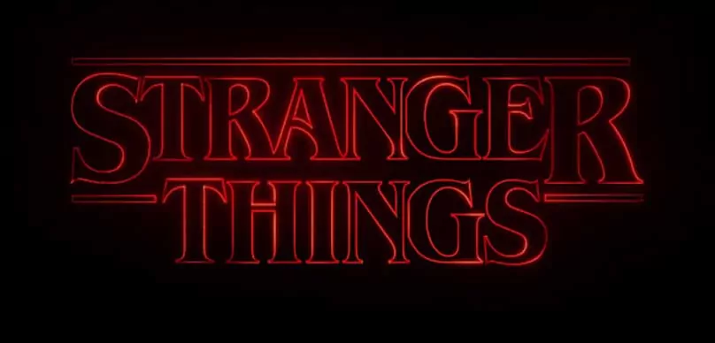
If you haven’t seen Netflix’s breakout smash Stranger Things you are missing out. Being a huge fan of the show I noticed the amazing opening title sequence that takes you back to the glorious ’80s. Then I began to think about the importance of typography and design in creating a feeling in film. The remarkable title sequence was created by legendary title house Imaginary Forces.
Title sequences should be used to create mood, tone, tell a story, and of course list the credits. Take a look at this amazing mini-doc by VOX on the opening title sequence of Stranger Things.
The Stranger Things logo probably looks strangely (no pun intended) familiar, returning you back to a time when Stephen King reigned supreme. The show’s creators, Matt and Ross Duffer, said that they were directly influenced by King in the creation of the show’s logo, having sent tons copies of Stephen King’s novels to Imaginary Forces.
The Font
The font used in the creation of the title sequence is ITC Benguiat, and it’s hallmark of the era that Stranger Things is paying homage to. It was used on the cover of countless Stephen King novels, The Smiths used it on the cover of their album ‘Strangeways’, and it was the title font for those ‘Choose Your Own Adventure’ books you loved growing up.
The glorious 1980s revived retro typography from various art periods in a way that brought new meaning to their use. By reintroducing them again in 2016, as the Stranger Things team did so remarkably, we are reminded of the power of typography, the transcendental property of design, and the nostalgia that lives forever in our hearts.
Indie filmmakers should take notice of the power of design in title sequences, posters, and website design when creating new content. Typography is a very powerful tool in the indie filmmaker’s toolbox.
If you haven’t watch Stranger Things yet, here’s the skinny on the show: This thrilling Netflix-original drama stars award-winning actress Winona Ryder as Joyce Byers, who lives in a small Indiana town in 1983 — inspired by a time when tales of science fiction captivated audiences.
When Joyce’s 12-year-old son, Will, goes missing, she launches a terrifying investigation into his disappearance with local authorities. As they search for answers, they unravel a series of extraordinary mysteries involving secret government experiments, unnerving supernatural forces, and a very unusual little girl.
Title Sequences in Indie Film
I’ve always loved title sequences and insert them into my films every chance I get. Take a look at this remarkable title sequence created by my main partner in crime Dan Cregan of Numb Robot for my short film “Cyn: A Twisted Tale“. This title sequence was shot by me and designed by Dan Cregan. It’s his homage to those amazing James Bond opening title sequences.
James Bond Title Sequence
Below is ALL 23 James Bond Title Sequences. A study in art and storytelling.

