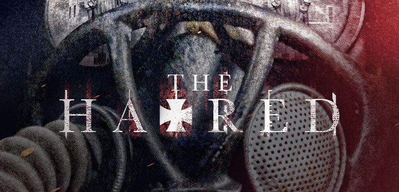
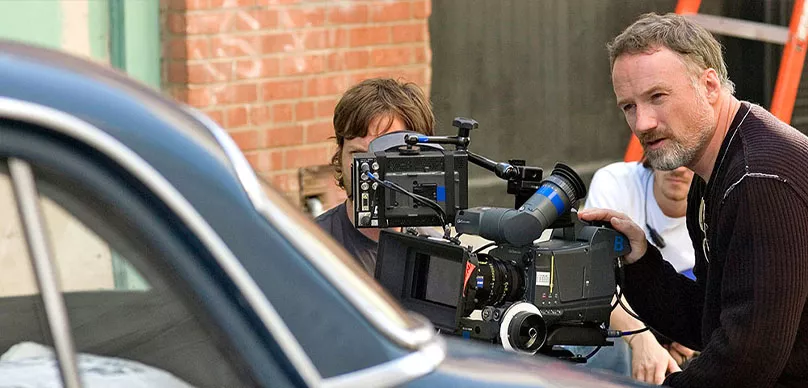
A film editor’s job is much like the work of a sculptor. You take a massive block of material—raw footage—and with a series of delicate, precise cuts, you shape it into something cohesive, something meaningful. In today’s episode, we welcome Michael Trent, a master of cinematic storytelling who has spent his career assembling some of Hollywood’s most unforgettable films. From the war-torn beaches of Saving Private Ryan to the eerie corridors of The Hatred, his work is the unseen hand that guides an audience’s emotions, turning chaos into art.
For Michael Trent, the journey into the editing room began long before he ever set foot in Hollywood. His father, a sound editor in England, introduced him to the craft at an early age. “I was using a Moviola by the time I was ten,” he recalls, describing the tactile magic of celluloid film. But talent alone wasn’t enough to break into the industry—his leap from England to Hollywood in 1994 was an act of faith, a cold call to the right person at the right time, proving that the universe often conspires in favor of those who dare.
Editing is not merely about cutting and pasting scenes together. It is about rhythm, about knowing when to hold a shot and when to move on. It is the balance between subtlety and impact, between quiet tension and explosive release. “I think a lot of editors cut too much,” Michael Trent shares. “You have to feel the emotion of a scene and let it breathe.” His work on The Hatred is a testament to this philosophy, particularly in its ability to sustain suspense, making audiences feel the presence of something sinister lurking just beyond the frame.
One of the most fascinating aspects of his career was working alongside Steven Spielberg. Editing Saving Private Ryan meant moving between locations, from an Irish field to an aerospace museum in England, adapting to whatever environment was necessary. But beyond the logistics, Spielberg’s ability to visualize an edit in his head was what amazed Michael Trent the most. “He called in from Japan with an edit suggestion, and when we made the change, it worked perfectly. It was as if he had a video camera inside his mind.”
Horror editing, in particular, demands a unique approach. Timing becomes everything—not just in the obvious jump scares, but in the slow-building unease that keeps an audience gripping their seats. A shadow lingering a second too long, a door creaking open just slightly out of sync—these are the choices that make a horror film work. “There’s a scene in The Hatred where Alice walks toward the cellar,” Michael Trent explains. “We held the shot longer than usual, just to build that sense of dread.”
To be an editor is to be both an artist and a storyteller, sculpting not with clay or paint, but with time itself. The true test of an editor’s skill lies not in what they add, but in what they take away. Sometimes, entire scenes—ones that took days to shoot—must be discarded for the sake of pacing and narrative flow. “You have to be ruthless,” Michael Trent says. “If it doesn’t serve the story, it has to go.”

